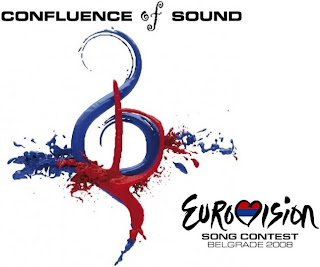
 Whilst I was very much with the herd in commenting on the Olympic 2012 logo, I like to think that most of you might not have seen this yet: the logo for the Eurovision Song Contest 2008, which is being held in Belgrade next month.
Is it just me, or is that really quite unpleasant? It looks like the treble clef’s struggling to stay afloat as a blood-red starfish clings to it and drags it under.
Also puts me in mind of the animated flowers in Pink Floyd’s ‘The Wall’ film, but that might just be my smutty tendencies coming to the fore.


Leave a Reply