
 I can’t wait for this film to come out!
I love the work of Bruce Tracy and Willis Morgan!
I can’t wait for this film to come out!
I love the work of Bruce Tracy and Willis Morgan!
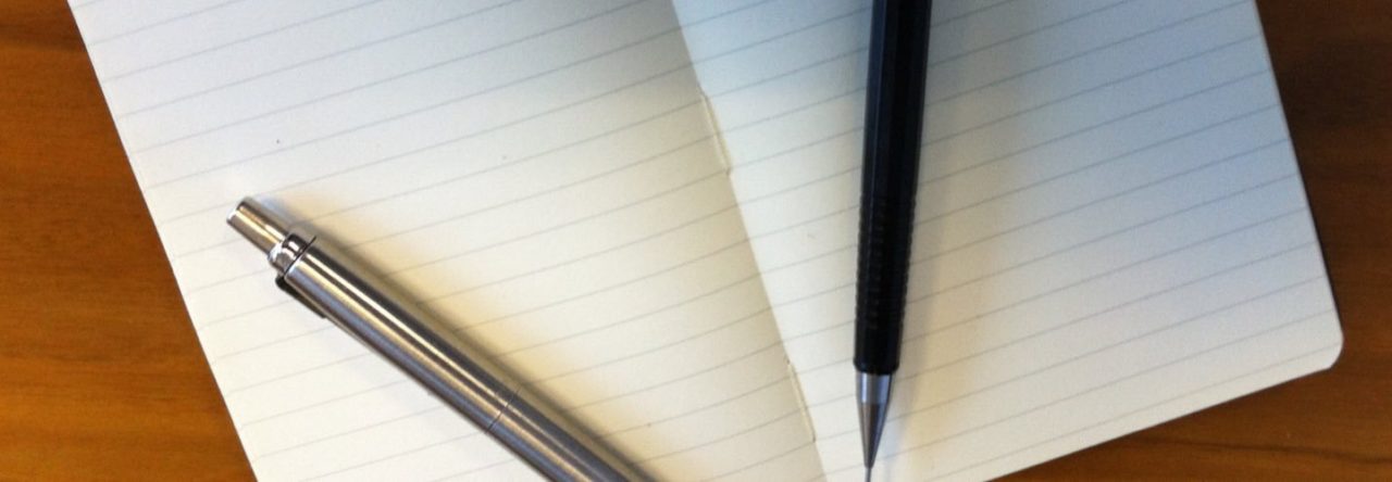
I’ve written before about my fondness for Moleskine notebooks, and I still use them as my scribble-place of choice.
And I can understand why, as an item of good design and quality, they inspire a certain following and indeed adoration (after all, the list of sites in the right-hand column of this blog includes Moleskinerie).
But this is just going too far.

I mean, really.
 The latest post in this occasional series is swimming against the tide a bit, but still…
There really is no need for watches to be waterproof to hundreds of metres. I’m qualified to dive, but only to 30 metres, and yet there are many watches which are water resistant to depths of 200m or more.
An example: the Omega Seamaster Planet ocean is water resistant to 600m. The deepest recorded dive using scuba equipment is 330m, just over half that. By 200m, the penetration of light from the surface is pretty much gone, so you’ll need a torch to read your watch (it doesn’t seem to glow in the dark or have a light, but I may have missed that). Similarly, the Rolex Submariner (dial pictured) is water-resistant to 300m, which seems a bit unnecessary.
Yes, I know there’s a lot to admire about watches with the impressive build and reliability of Omega and Rolex, but this just seems excessive. I’m pretty certain there’s a middle ground to be struck between making something sturdy enough to survive the general bashes and splashes of everyday life (so: a watch that doesn’t scratch, and will withstand water if you go for a swim, a shower or do the washing-up) and building something to withstand events that very few people are actually likely to experience.
Then again, since many of these watches which are strangely water-resistant to the depth of the Mariana Trench are top-of-the-line models, maybe reducing the spec and reducing the price, even if it means increased sales, might work against the prestige aspect of the watches?
Hmm. Maybe it’s ‘intelligence’ in marketing terms at the expense of design intelligence, then.
 Continuing the occasional – and unequivocally highbrow – series of posts on the subject of urinals, here’s one that, for the chaps, saves you the trouble of shaking.
Though would you really trust that claw-like hand?
And god only knows what the designer of this was thinking. I can only hope it was 4am, the deadline was close, and the Rolling Stones started playing on the radio…
 Free (well, you have to collect tokens) with the News Of The World last weekend: a pair of hair straighteners, as demonstrated by Nikki Sanderson, ex of Coronation Street, in the picture here.
Well, they’re saying that they’re hair straighteners, but on the basis of the picture, you’ll be getting something more like a stapler.
I can only hope Nikki doesn’t have to be anywhere in any kind of hurry, as with hair that long, and a pair of ‘straighteners’ that small, I think it’ll be a while yet before she’s ready to go out.
 … is this really a good idea?
It has the feel of a wrong turn to me, in all honesty. I would have thought a one-line display (even built into the headphone cord, as the new controls are) would have been more advisable.
We’ll see if people go for it, I guess, but it’s certainly not a feature I’d want. Perhaps because, to my not-well mind, it all appears rather reminiscent of MC Hawking.
Then again, maybe it’s just an April Fool’s Day gag that was accidentally released three weeks early…
 Staying in hotels is, of course, one of life’s great delights; as well as televisions with fewer channels than one can watch at home, and showers which have two extremes of temperature (Inferno and Arctic) and nothing in between, there’s always the thrill of using the ‘tea and coffee making facilities’.
If the room has a fridge, you might have some real milk, so you can make a proper cuppa, but more often than not, you’re likely to have a kettle, cups, teabags, and, in some form or other, UHT milk. UHT milk is obviously handy for hotel-owners, as it lasts for ages (decades after we humans are dust and gone, the giant radioactive cockroaches will still be finding stashes of it and drinking it in an attempt to fend off Causium-234-induced osteoporosis), but it doesn’t taste very good at all… by which I mean it tastes of virtually nothing at all, being more like a homeopathic version of Tipp-Ex than milk.
Anyway, UHT milk used to be supplied in hotel rooms (and on trains and service stations and other strangely neither-here-nor-there places) in little pots, like miniaturised yogurt pots, with a foil lid; as Ben Elton noted in the 1980s, these pots appeared to have been spot-welded shut, so it was a battle to get them open, invariably resulting in you showering what little ‘milk’ lurked within all over the place. And Ben was right to point this out, but the so-called solution is no better, quite frankly: ladies and gents, the milk processing people and hospitality industry proudly present (while the rest of us just resent)… Dairystix.
Yes, all the lack of flavour of UHT milk, now in a longer-than-it-is-wide foil tube. Apparently taking their design cue from those Mr Freeze ice pops which can be found in the Walls freezers in newsagents in summer, the idea is that you tear the end off the ‘stick and then pour the milk (well, it’s UHT, so I use the term in its loosest and least-accurate sense) into the cup. Which would be fine, if the ends actually tore off in anything approximating a straight line. But that’s not likely to happen with the ‘dotted lines’ you have to tear along, because they’re coated with plastic and so you get an untidy tear along it. Which, when you squeeze the tube, means the milk comes out of two or three places in the end of the tube, like a man trying to urinate after someone’s stapled the end of his prepuce (if that comparison appalls you, you may want to stop reading now – there’s worse to come before this rant is over).
The reward for all this is a pathetic splash of not-milk, which barely coats the bottom of most cups. So you have to put two in, though you’ll be lucky in most hotels to get more than two of the sticks per person, so you’ll have to think carefully about when you drink your tea. And even then two isn’t really enough to make it look like tea. And the reason for this is pretty pathetic; these milk sticks, like the milk pots before them, contain a minimal amount of milk.
In fact, I’m such a sad pedant that I actually did a bit of research to try and find out just how much (or, rather, how little) UHT milk is contained in a DairyStix. Appallingly, it is 12ml, or about 4% of a can of Diet Coke. So, all that effort wrestling with the end of it and then you squeeze down the length of it several times over, resulting in a spray in unexpected directions? All of which is – frankly – little more than the overall quantity of the average male ejaculation (where do you think the group 10cc got their name)? Perhaps it’s in some way connected with the choice of films on the in-room TV.
Anyway, my friends, as something that doesn’t work and yet looks quite modern and flashy, this is a pretty classic example of Unintelligent Design. Yes, perhaps I love my tea a bit too much, but it seems that the makers of DairyStix and similar items treat the making of tea and coffee with a little bit less love than they should, given that it’s part of how they make their living.
 So, this book comes out next week – Sebastian Faulks (whose work I must admit I haven’t read, though people whose opinions I trust speak highly of his writing) has written a new James Bond novel (with the blessing of Fleming’s estate). All very well and good, but what’s that in the bottom right-hand corner?
‘Sebastian Faulks Writing As Ian Fleming’, it seems.
Now, maybe I’m just exacting to the point of pedantry, but you can’t really claim that, can you? Oh, sure, when Virginia ‘Flowers In The Attic’ Andrews died the family got another author to be cover-credited as ‘The New Virginia Andrews’, rather bewilderingly, but I don’t think I’ve ever seen the phrase ‘writing as’ used (by which I mean misused) in such a way.
‘Writing as’ is, you see, used when you’re writing under a pseudonym, not trying to write something in the style of another author. There are high-profile authors who’ve ‘written as’ – Stephen King writing as Richard Bachman or Norah Roberts as JD Robb , but that’s because those were made-up names and not real people they were seeking to emulate (given that Bachman allegedly claimed his religion was ‘rooster worship’, that’s probably for the best in Steve K’s case).
For crying out loud, when Kingsley Amis wrote a Bond book, he did so under a pseudonym, but the editions of that book which state his true identity say it was ‘Kingsley Amis writing as Robert Markham’ (as you can just about see if you peer at the bottom of the cover here).
I’m guessing it’s not Mr Faulks’s fault; he seems to be a genuine fan of Fleming’s work, and is trying to emulate the style of Fleming – but then again, so was Raymond Benson, the previous author who wrote authorised Bond novels, and his cover credit wasn’t that he was writing as Ian Fleming, it was just his name. Unlike Faulks, who’s well-known in his own right, Benson could probably have used that kind of promotional push. And marketing is where I think the idea for this bizarre bit of branding probably originated, to be honest – I just wish that they’d put something like ‘After’ or ‘In The Style Of’ or… I dunno, maybe come up with their own set of words to describe it, rather than using a phrase which already has a meaning.
Unless, of course, this is the way the popular kids are using the phrase ‘writing as’ now. That being the case, this post is by John Soanes, Writing As Charles Dickens.
Powered by WordPress & Theme by Anders Norén